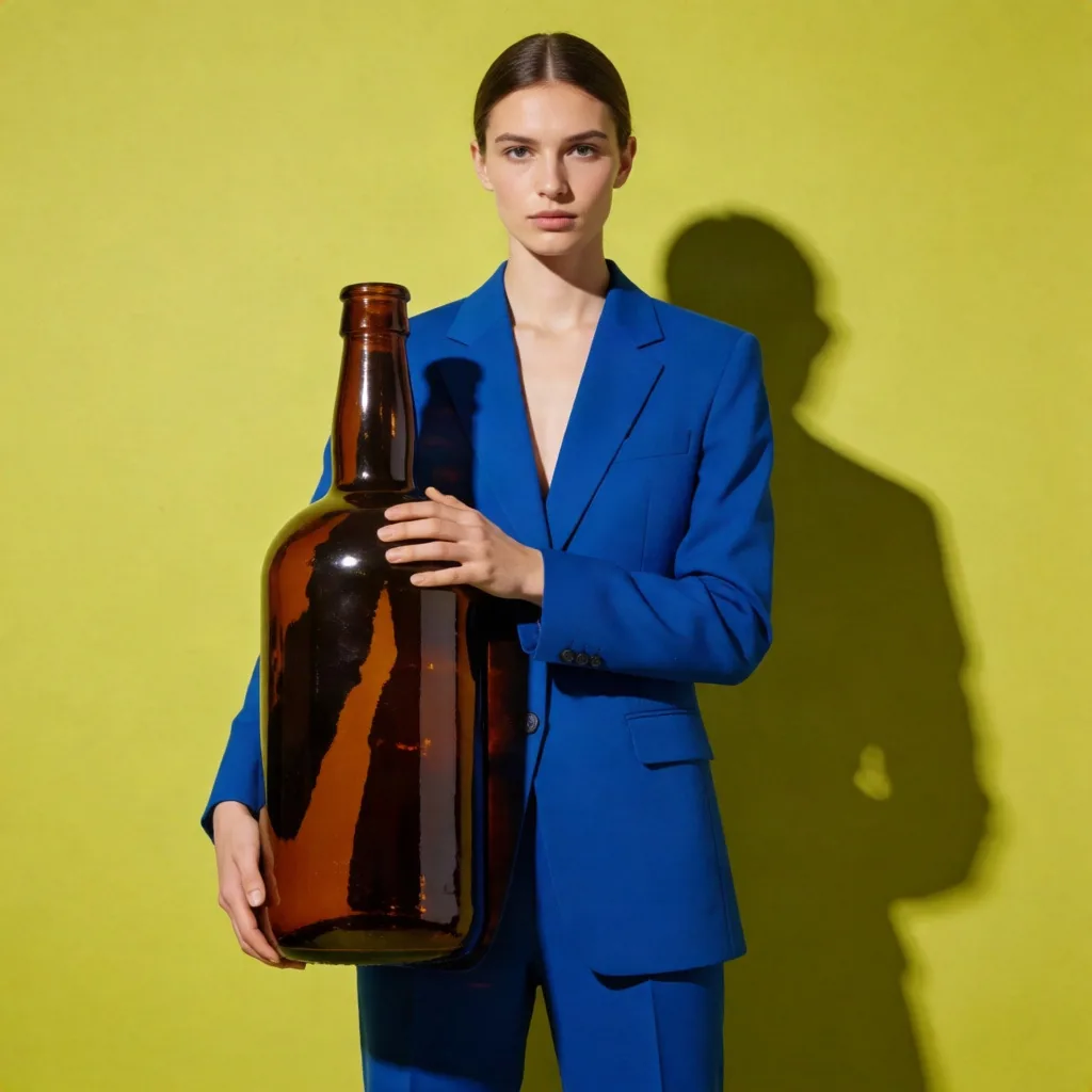
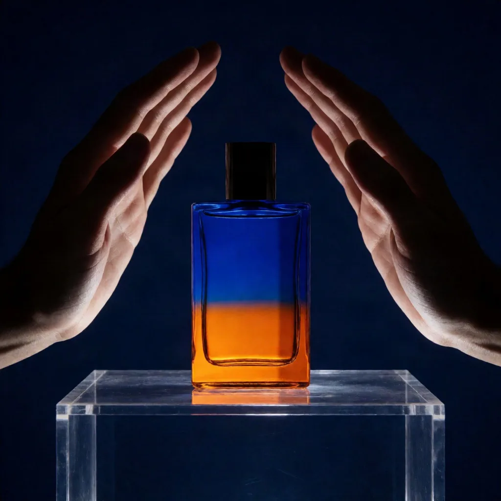
Night fragrance campaign
Cobalt-and-amber color blocks and direct studio light carry into a polished nighttime fragrance campaign.
Visual carryover: Color blocking, studio light, hands-forward framing
 Krea 2
Tool · Style references
Use Krea 2 image to image with one clear visual reference, then describe a new subject and frame. The model can carry palette, light, texture, and medium without promising a pixel-preserving edit.
01 · Reference images
Drop JPG, PNG, or WebP files here. 10MB maximum per image.
02 · Describe the new subject and frame
03 · Crop & model tier
Selected files stay in your browser until you submit a generation.
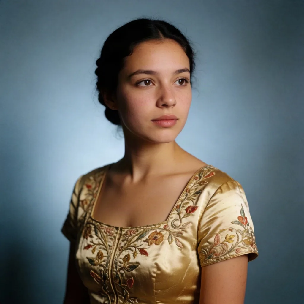
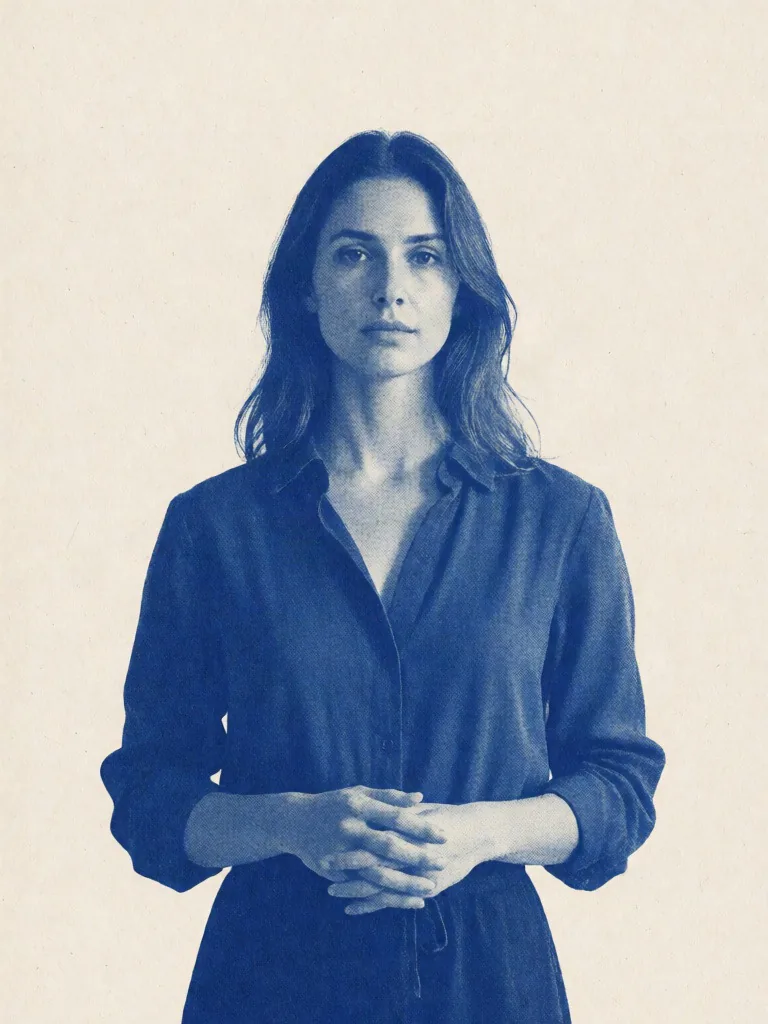
Risograph portrait
The source palette and frontal light become a two-ink risograph portrait with halftone dots and cream-paper texture.
Every pair is a first-party Krea 2 Medium result. Compare how palette, light, texture, and medium carry into a new subject.
Cobalt-and-amber color blocks and direct studio light carry into a polished nighttime fragrance campaign.
Visual carryover: Color blocking, studio light, hands-forward framing
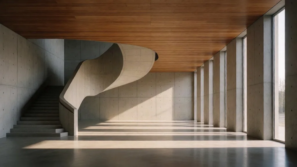
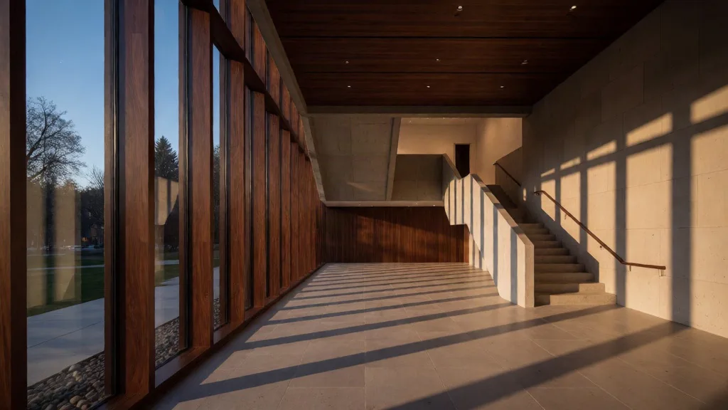
Geometric framing, staircase rhythm, and long shadows reshape the scene as a warm museum atrium at dusk.
Visual carryover: Geometric framing, staircase rhythm, long shadows
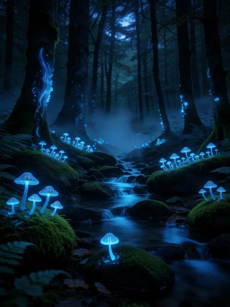
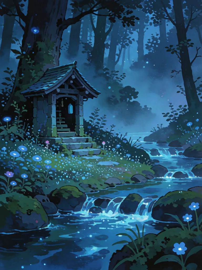
Cool bioluminescent color, mist, and ground glow become a hand-painted gouache shrine scene.
Visual carryover: Bioluminescent palette, layered mist, luminous detail
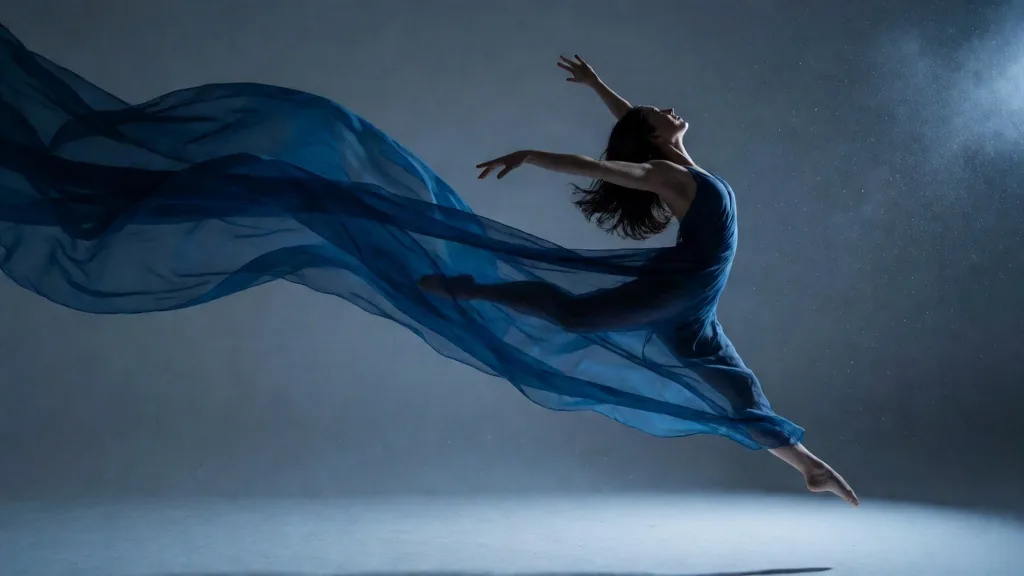
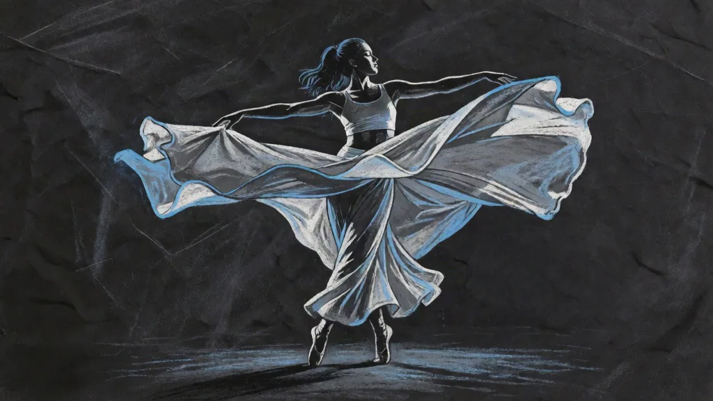
Diagonal movement, blue rim light, and suspended fabric translate into an ink-and-chalk study on charcoal paper.
Visual carryover: Diagonal movement, rim light, fabric energy
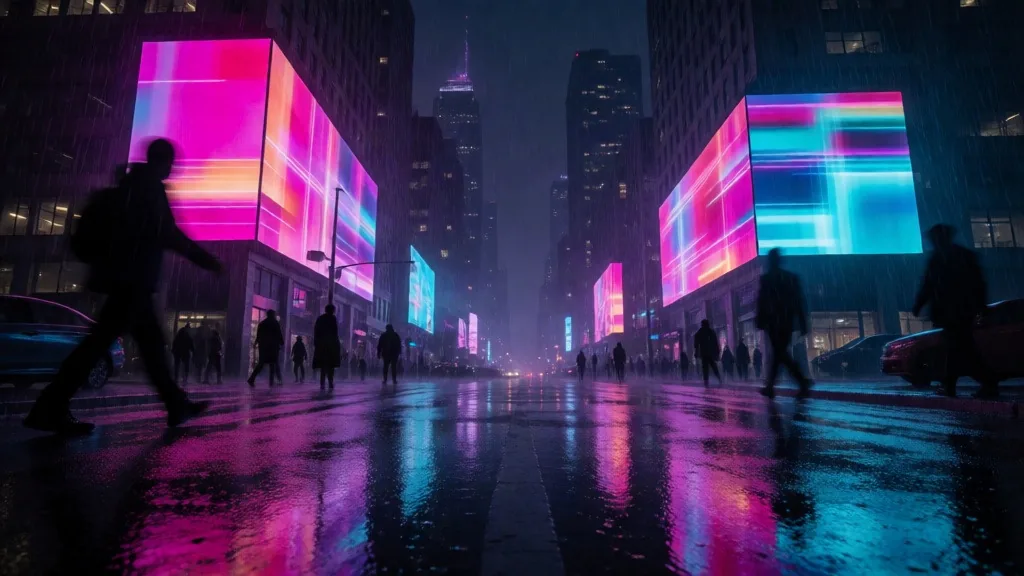
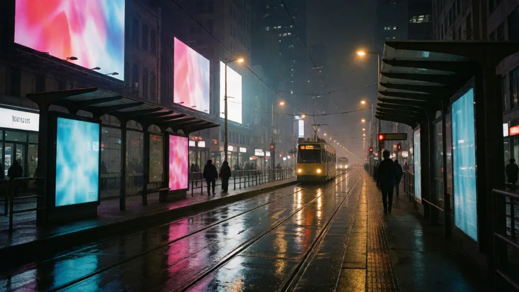
Low perspective, neon reflections, and urban haze become a restrained 35mm tram-stop photograph after rain.
Visual carryover: Low perspective, neon reflections, urban haze
Treat the reference as visual direction, not a precision edit mask. Check the task boundary before choosing the model.
Carry relationships between the dominant color, shadows, and highlights.
Borrow source direction, hardness, color temperature, and reflection behavior.
Reuse grain, paper, brushwork, glass, metal, or other surface language.
Guide the new result toward a photographic, print, illustrated, or rendered finish.
A style reference does not promise the same face, identity, or exact pose.
Short copy, marks, and package geometry may drift, so this is not a precision brand edit.
Removing a phone, swapping clothing, or changing one region may work, but it is not the model’s exact contract.
The output is a newly generated image guided by the reference, not a reversible source conversion.
Establish a one-reference baseline, then add written control in stages instead of changing every variable at once.
Start with one readable visual idea and crop away unrelated panels, borders, or text.
State the person, object, action, and required frame in plain language.
Match the aspect ratio to the deliverable, then choose exploration or final-detail quality.
Judge whether palette, light, texture, and medium carried over—not whether every pixel stayed fixed.
A useful reference makes palette, light, material, or medium easy to read and removes unrelated panels, borders, and text.
Establish a one-reference baseline before adding a second image that contributes a different trait.
Call out palette, grain, lighting, or medium in the prompt instead of making the model guess.
The reference carries style; the text must still define the new subject and composition.
Use a preservation-led edit model when identity, exact text, or product geometry must stay fixed.
Use the reference as a repeatable visual rule rather than one-off decoration.
Carry palette, mark-making, and medium into a completely different subject.
Repeat one lighting and surface language while changing the product or campaign story.
Use an existing mood frame to guide a new character, environment, or key visual.
Hold the compositional direction steady while exploring color and time-of-day variations.
Carry visible evidence such as glass, metal, paper, grain, or brushwork into a new frame.
Before generating, read the reference as a system of relationships rather than a picture to copy. In a Krea 2 image to image workflow, hierarchy, palette, lighting, crop, and surface treatment provide distinct signals. Separating them helps you decide what should carry into the new subject and what can change.
Identify what your eye notices first, what supports it, and how much space belongs to the background. A reference image can suggest dominance and subject-to-environment scale, but it cannot place a new subject at exact coordinates or preserve identity and pose. Crop competing focal points until one direction remains easy to read.
Separate the dominant field color from supporting tones, shadows, highlights, and small accents. A style reference can guide those relationships more usefully than a list of isolated color names. Exact object colors may still drift, especially where reflective surfaces mix the palette, so judge the overall color logic before individual pixels.
Look for the apparent light direction, softness, color temperature, falloff, and the way highlights move across glass, metal, skin, or paper. State the important relationship in the prompt. The source image can guide lighting logic, but complex reflections and shadow edges may change when the model rebuilds them around a different subject.
Note the viewpoint, subject distance, horizon, negative space, and balance before choosing an output ratio. Broad composition habits can transfer, while the exact crop may shift to fit the new subject. If placement matters, describe the intended frame in text and leave enough perimeter room for a later layout crop.
Decide whether the useful signal is photographic grain, risograph dots, dry brushwork, glossy 3D surfaces, paper fibers, or another finish. Texture works best when it supports a clearly named medium. Fine weave, lettering, logos, and small material details can change, so treat them as direction rather than exact reproduction.
After generation, compare the result with the visual brief rather than the source pixels. A useful review checks whether the new subject reads clearly, whether the intended visual relationships survived, and which single controllable variable should change in the next attempt.
Ask whether the new subject is immediately recognizable at the intended viewing size. Check silhouette, separation from the background, important props, and the requested framing before judging surface style. A beautiful texture cannot rescue a confused subject. If the hierarchy is wrong, clarify the subject and action before changing the reference image.
Compare broad palette relationships, lighting direction, texture, medium, and compositional balance. These are the useful measures of reference carryover. Do not treat matching pixels as the goal: the result is a new generation, and it does not promise the same face, pose, product geometry, text, logo, or exact local detail.
Zoom in on faces, hands, object edges, mirrored surfaces, typography, and repeated patterns. Decide whether a flaw needs another generation or a precision editing tool. Object removal, clothing changes, identity preservation, readable packaging, and isolated regional edits are not guaranteed by this reference workflow, even when an individual attempt looks close.
Change one control you actually have: prompt wording, the crop of the reference image, the number of references, aspect ratio, or model tier. Keep the others stable and record what moved. This makes each image-to-image comparison useful and prevents several simultaneous changes from hiding which decision improved or weakened the result.
The page keeps selections in the browser first. Private account storage and provider processing begin only after submission.
Use up to five images, each no larger than 10MB.
Medium Turbo, Medium, and Large use different credit amounts.
Submitted references use a private R2 path and can be deleted in Settings → Files.
Yes. Uploaded images act as style references for palette, light, texture, and medium. This is not traditional img2img that promises to preserve the source pixels.
The interface accepts up to five. Start with one reference and add another only when it contributes a different, compatible trait.
You can select JPG, PNG, or WebP files up to 10MB each.
Not reliably. Use a dedicated identity-preserving or local-edit model when the same person must remain exact.
You can ask, but Krea 2 style references are not a masked local editor and cannot promise that only the requested region will change.
Palette, light, texture, medium, and compositional habits transfer most reliably. The text prompt still defines the new subject.
Medium is the balanced default. Use Medium Turbo for fast exploration and Large when the final frame depends on finer material detail.
New accounts receive 10 welcome credits. A run uses 5, 10, or 15 credits for Medium Turbo, Medium, or Large.
Files stay in the browser until you submit. They are then stored as private account files in R2 and sent to the generation provider. Delete them from Settings → Files.
Commercial use depends on the current plan, service terms, rights in the reference image, and applicable law. Check each before publishing paid work.
Build the subject, camera, light, and medium before adding a reference.
ExploreGuideLearn what the written brief controls and what a reference contributes.
ExploreModelsCompare Medium Turbo, Medium, and Large by cost and use case.
ExploreAll toolsExplore prompt, product-shot, and reference-image workflows.
ExploreUpload one clear visual direction, describe the new subject, and choose the tier that fits exploration or final delivery.